
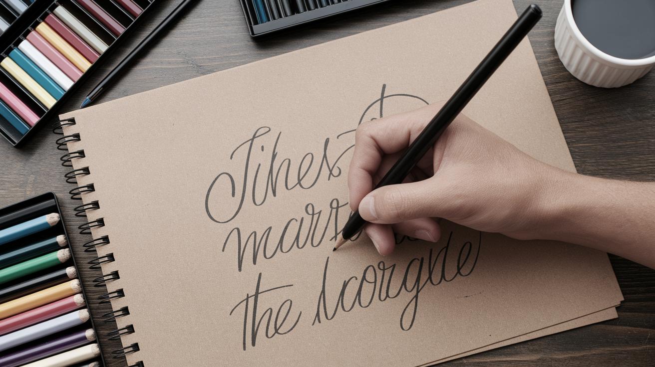
Exploring the Art of Drawing on Toned Paper
Drawing on toned paper opens a new realm of creativity and expression for artists of all levels. This medium provides a unique background, allowing for contrast and depth that standard white paper cannot offer. In this post, we’ll explore five essential tips for getting the most out of your toned paper experience. We’ll delve into unique sketching challenges such as the 10-minute thumbnail sketch of birds and capture the essence of floral art by focusing on the diversity and individuality of irises. Additionally, we’ll discuss the importance of starting a painting with design and values and how indicating rather than illustrating can enhance your art. Lastly, we’ll feature a painting of the week, highlighting the striking beauty of “Old Copper and Fruit.” Whether you’re a seasoned artist or just beginning, these insights will enrich your technique and appreciation for drawing on toned paper.
5 Tips for Drawing on Toned Paper
When working with toned paper, understanding its unique characteristics is key to achieving beautiful results. First, consider your color palette. Toned paper often comes in shades of gray, tan, or earth tones, so selecting hues that stand out against this backdrop is crucial. Experiment with complimentary colors to see which ones resonate most effectively on the paper’s surface.
Another tip is to embrace the paper’s mid-tone as part of your drawing. The paper itself can serve as a middle value, allowing you to add depth with both darks and lights. Utilize white charcoal or pastel to highlight areas, adding a dynamic range that plays beautifully against the neutral background. Lastly, choose the right tools. Pens, pencils, and pastels all interact differently with toned surfaces, so test these mediums to discover which best suits your style and the paper you choose.
10-Minute Thumbnail Sketch Challenge: Birds
Engaging in quick sketch challenges like the 10-minute thumbnail sketch can sharpen your skills and creativity. Birds, with their varied forms and postures, offer a delightful subject. This exercise encourages rapid observation and swift mark-making, which is especially effective when done on toned paper. The inherent mid-tone provides a head start on establishing shadows, allowing you to focus on shape and form.
When tackling this challenge, use expressive lines to capture the essence of the bird’s movement. Start with light contours and gradually build up with stronger strokes. Employ white highlights to accentuate key features like the bird’s feathers or beak, making your sketch pop. This practice not only enhances your speed and precision but also trains your eye to observe essential details quickly.
A Floral Spotlight: Each Iris Has Its Own Personality
Drawing florals on toned paper can result in striking artwork that highlights each flower’s unique traits. The iris, known for its intricate petals and vibrant colors, stands as a beautiful subject. When drawing irises, pay attention to the varied textures and layers of petals, which can be effectively captured using the paper’s hue as a natural middle tone.
Concentrate on each iris’s distinct personality, from its curves to its color contrasts. Use a combination of soft pastels and charcoal to define bright spots and shadowed recesses, giving your drawing a realistic yet artistic flair. Through thoughtful use of lines and highlights on toned paper, you can bring out the individuality and elegance of each bloom.
Starting a Painting with Design and Values
The foundation of any solid painting begins with a good design and value sketch, particularly relevant on toned paper. Before applying any color, map out your composition in terms of shapes and leading lines. Toned paper helps with this process by providing an immediate sense of depth and contrast.
Values are crucial; start by blocking in the darkest areas and gradually build up to the lighter tones. This method not only helps in plotting the basic structure of your painting but also in establishing the mood. The mid-tone of the paper can serve as a guide to work both upwards to the highlights and downwards to the deeper shadows, achieving a balanced and visually compelling image.
Indicate, Don’t Illustrate
The philosophy of indicating rather than illustrating is especially powerful when applied to drawing on toned paper. This technique allows you to suggest details with minimal lines, letting the viewer’s imagination fill in the gaps. It’s a technique that leverages the natural aesthetic of toned paper to create depth and interest.
Encourage suggestion in your art by focusing on essential elements that convey the subject’s essence. Use soft transitions and key highlights sparingly to create a more interpretive piece. By doing so, you invite viewers into the narrative, compelling them to engage more deeply with your work, thus enhancing their experience through artistic simplicity and elegance.
Painting of the Week: “Old Copper and Fruit”
This week’s featured painting, “Old Copper and Fruit,” illustrates the profound impact of contrast achieved through toned paper. The composition’s rich textures are masterfully highlighted using the paper’s mid-tone, accentuating the metallic sheen of the copper and the richness of the fruits.
The artist’s use of lighting and shadows brings a three-dimensional quality to the still life, demonstrating how adept handling of values can enhance visual storytelling. By employing the toned paper’s characteristics, the artist creates an interplay of light that draws the viewer in, exploring the nuances and beauty of everyday objects with fresh eyes.
Next Steps
| Section | Main Points |
|---|---|
| 5 Tips for Drawing on Toned Paper | Utilize the paper’s mid-tone, choose complementary colors, and select appropriate tools. |
| 10-Minute Thumbnail Sketch Challenge: Birds | Quick sketching for capturing movement, using white highlights for detail. |
| A Floral Spotlight: Each Iris Has Its Own Personality | Focus on texture and individuality using pastels and charcoal for highlights and shadows. |
| Starting a Painting with Design and Values | Map out compositions, use tones to guide light and shadow. |
| Indicate, Don’t Illustrate | Suggest details with minimal lines to engage the viewer’s imagination. |
| Painting of the Week: “Old Copper and Fruit” | Exemplifies contrast and depth through effective use of toned paper. |

